[dev.icinga.com #3396] Revamped cronk list menu, list and icon style, scroll behavior #950
Comments
|
Updated by pdeneu on 2012-10-25 12:59:49 +00:00 i think it would be even better to get option in user menu to select if icons or text are displayed. |
|
Updated by mfriedrich on 2012-10-25 13:11:02 +00:00 or that one. though, i was thinking of how the extjs menu is done in various demos - there's also sort of a tree view possible, but i doubt that this would fit for the general menue - unless the cronk "categories" would support grouping there as well (dynamic). |
|
Updated by mfrosch on 2012-11-29 09:24:38 +00:00
Done in my branch mfrosch/ui-improvement See Screenshort attached New cronk list style, icon style still selectable CSS styles updated |
|
Updated by mfrosch on 2012-11-29 09:25:14 +00:00
|
|
Updated by mfrosch on 2012-11-29 09:27:10 +00:00
Another screenshot |
|
Updated by mfrosch on 2013-02-22 16:39:35 +00:00
Merged into master |
|
Updated by mfrosch on 2013-02-22 16:40:11 +00:00
|
|
Updated by mfriedrich on 2013-03-01 20:29:55 +00:00
|
|
Updated by mfriedrich on 2013-03-01 20:39:06 +00:00 since this introduces a change in behaviour to the gui, i'd like to hear more opinions on that. |
|
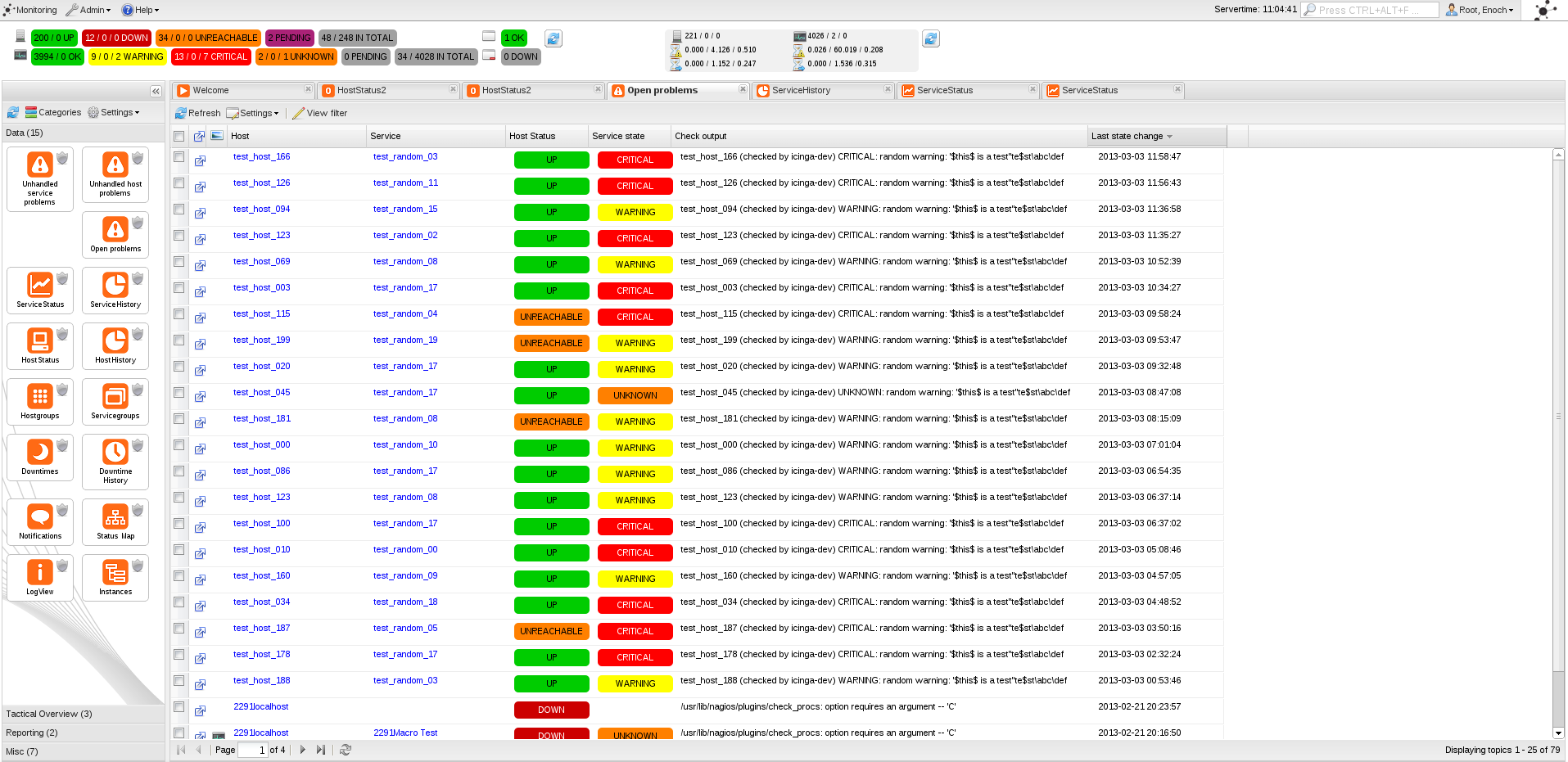
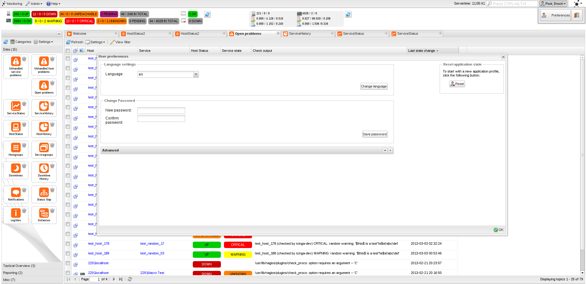
Updated by mfriedrich on 2013-03-03 11:13:27 +00:00
there's a problem when upgrading from r1.8 to next (say "1.8.x to 1.9.x"), having that change of the menu enabled. if you do not reset the application state for the user, the width of the menu is smaller (like the small icon list would need), but the bigger icons are still shown, and somewhat disordered. this should be taken into account when proposing this change to users, especially when support questions may turn in. other than that, i still like the new view. r1.8 (1.8.2) with big icons menu next (pre 1.9.0) with current appstate after upgrade next (pre 1.9.0) reset appstate for the user next (pre 1.9.0) with small icons list |
|
Updated by mfriedrich on 2013-03-03 11:17:46 +00:00
maybe the appstate reset can be resolved somehow, at least it should be mentioned in the upgrade docs. the docs issue should be opened once the direction (which menue is the default?) to go is clear. it should contain
|
|
Updated by mfrosch on 2013-03-13 16:28:01 +00:00
|
|
Updated by mfrosch on 2013-04-03 14:37:28 +00:00 https://www.icinga.org/2013/03/19/vote-on-your-future-icinga-web-cronk-menu/ TODO: Update Docs, Check config for comments on the setting |
|
Updated by mfriedrich on 2013-04-12 16:48:15 +00:00 the docs are uptodate on docs git 'next' including updated images and the change setting. which configuration do you mean? might require some docs text too. |
|
Updated by mfriedrich on 2013-04-19 14:46:59 +00:00
see #3983 for config option and further docs. |
This issue has been migrated from Redmine: https://dev.icinga.com/issues/3396
Created by mfriedrich on 2012-10-24 18:01:07 +00:00
Assignee: mfrosch
Status: Resolved (closed on 2013-04-19 14:46:59 +00:00)
Target Version: 1.9
Last Update: 2013-04-19 14:46:59 +00:00 (in Redmine)
Improving the design and behavior of the cronk menu
old description
some people prefer it more static (like the classic ui), so the clickable icons might confuse people away.
my proposal - add simple static links to the left menu, basically all categories open, but allowing to hide them on demand (like classic ui).
i am not sure if that fits with the current fancy layout, but it would maybe help in acceptance when moving from old to new.
Attachments
Changesets
2012-11-29 09:19:27 +00:00 by (unknown) 17b55c9
2013-03-13 16:28:08 +00:00 by mfrosch 23926e4
2013-03-13 16:31:38 +00:00 by mfrosch 6f0868b
2013-04-03 14:01:55 +00:00 by mfrosch 54199ce
Relations:
The text was updated successfully, but these errors were encountered: